Easy Web Design Tips to Boost E-Commerce Sales
Online Shopping Rules!

Everyone knows that more people are taking advantage of the convenience of online shopping. In fact, a record number of people shopped online on Black Friday, year over year since at least 2010. Americans enjoy shopping in the comfort of their own homes, and they expect a pleasant experience on your website. They want your website design to catch and hold their attention, to be easy to navigate, and to be organized in the way they expect.
So how did your e-commerce site do this past holiday season? Was it a pleasant experience for your customers? Did it help increase sales? Or, did it frustrate your customers?
The 3-Second First Impression
Consumers evaluate your website in the first three to five seconds. If it doesn’t appeal to them immediately, chances are they’ll move on and you’ll lose a sale. Here are some web design tips to ensure that your ecommerce website passes muster in that first three to five seconds and beyond.
Make sure your pages load quickly
If your site takes longer than 2 seconds to load the primary text and graphics, you’ve lost your customer.
Two seconds is a long time to watch a frozen page.
Plus, website speed and page load times can impact your position in search engine result pages.
To ensure your pages load quickly, scale your images to size before uploading them (use file optimization software to reduce the “weight” of your images). GIFs work best for images with just a few colors, such as logos. JPEGs are best for images with lots of colors and details, such as photos. PNG’s are best for high-quality transparent images.
Create an attractive design
Your website’s design is the first thing they’ll notice.
Make sure the images are high-quality, your site has a nice layout, and your text is concise and easy to read.
State your unique value proposition in your headline
With only a few seconds to capture your customers’ attention, if your value proposition is buried, they’ll never see it.
Don’t make your headline something generic like “Welcome to our site.”
Instead, i
mmediately tell them how they will benefit from your products and/or services.
Again, be concise – go for the quick connection.
Use relevant images
Your images should support your message and be unique to your site (like the one included in this post!), not generic or familiar-looking stock photos.
Don’t confuse your customers with images that don’t match your message or the accompanying text.
Make it easy for your customers to get around your website
If your customers get lost in a maze of pages, they’ll quickly go somewhere else.
All navigation bars should be clearly labeled.
A top navigation bar can show general categories for your pages, while a side menu allows your customers to find specific products and/or services.
Focus on your customers
Use “you” and “your” instead of “we” and “us.”
Prove that you’re the expert in your product or service, but do it in a language that is easily understood.
Make your landing pages match your ads
If you’re using banner ads or pay-per-click (PPC) ads, make sure that what your customer sees in your ad is consistent with what they see when they land on your site.
If they’re looking at a pair of boots in your ad, don’t take them to your “product categories” page; take them directly to the boots page.
Prove you are protecting their information
Identity theft, computer viruses, and credit card fraud is a concern for many people.
You need to demonstrate that you are keeping their information safe by providing security certificate seals, customer reviews and testimonials, and a detailed privacy policy.
Place your most important information “above the fold”
This is an old journalist’s trick that places the most important stories at the top of the page, above where the newspaper is folded.
The fold for your site is the point where your customer needs to scroll to see more.
The Nielsen Norman group reports that web users spend 80% of their time above the fold.
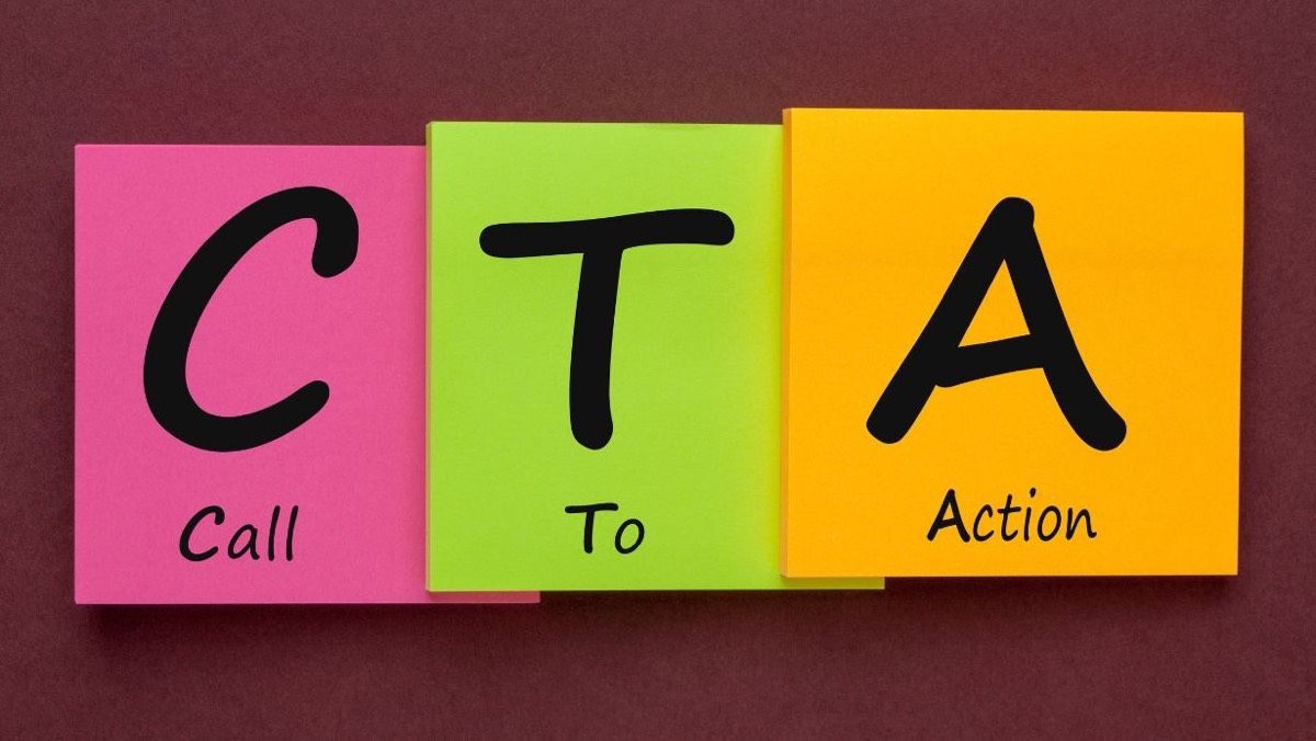
Provide effective calls-to-action (CTA’s)
It’s best not to overwhelm or annoy your customer with too many buttons, forms and other CTAs.
Limit it to the most relevant CTAs that will take them to the most important next step. Make sure it’s clear where that click will take them and keep the CTA above the fold.
If you have too many CTAs that interrupt their experience, they’ll quickly abandon your website.
Make your website design mobile friendly
According to the Pew Research Center, 45% of American adults use smartphones and 25% use tablets (and those figures are rapidly growing), so if you don’t want to lose those customers make sure your site is optimized for mobile devices. Keep text concise, use a single column, and make sure your forms are simple.
Contact PMI to Improve Your eCommerce Website
These ecommerce web design tips will help make your customers’ experience on your site more pleasant, which will keep them there longer, and help increase your sales. If you need help in developing an ecommerce website that meets all of the above guidelines, please contact us online or call us at 484-297-6395 .
This post is summarized from an article by Greg Wise – “ 12 Tips to Ensure Your Ecommerce Site Passes the Blink Test.”