Mobile Website Design: See the Difference for Yourself
You know your business needs and deserves a mobile-optimized website, right? Given the ever-increasing pace of website traffic from smartphones and other mobile devices, it’s only a matter of time before your non-mobile site will share all too many characteristics with the dinosaurs of ages past: outdated, cumbersome, and extinct!
Test Your Website for Mobile Viewing
To prove the point, we invite you to test your patience with any website that is not yet optimized for mobile (perhaps your own?). Here’s what you’ll encounter:
- Text that is too small to read, even when you turn the phone sideways, especially for 40-somethings
- Menu buttons or links that are difficult, if not impossible, to use unless you first expand them
- Frustration over not being able to navigate and view the site with one hand
Look in the Mirror
Now ask yourself: if you were your customer, would you put up with this if the next competitor offered a mobile-friendly experience? Is your mobile website design sending the right message to your potential customers? Can you afford that?
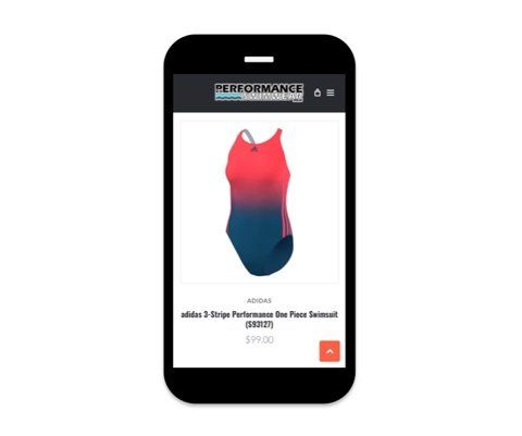
Here’s Proof
Here’s proof of the difference a properly designed mobile website can make. Take a look at the before and after mobile views of the website below.

- The navigation buttons are clear and large enough to be accessed easily with one hand
- The text is pleasantly large
- The calls-to-action practically jump off the page: Call Us, Find Us, and Buy Tickets (found further down the page)
- Some of the content has been rearranged to make it more intuitive for mobile users
Need Help Making Your Website Mobile Friendly?
If your mobile website experience currently projects an image that is frighteningly similar to the dinosaur, then contact us today to discuss a mobile web design upgrade. It costs less than you think, and your customers will thank you!


