Web Design Basics for Business Owners
Revised 3/24/2020
Every business owner understands the importance of having an online presence, and one of the essential elements of that presence is your website. It’s kind of like the hub of a wheel. It’s where you direct prospects and convert those prospects into clients.
There are many different aspects of a successful website, but one of the most important goals when designing your site is to make it as user-friendly as possible. Regardless of the industry you’re in, you are probably competing with many other websites online, so if prospects can’t find the information they’re looking for quickly, they’ll quickly move on to your competitor’s site.
If that happens, you’ve lost the opportunity to convert those prospects into customers.
Creating a website that is intuitive and provides a great user experience will keep prospects on your site longer, giving you a better opportunity to convert them into paying customers.
Here are five web design basics to ensure that your website is providing a good user experience:
1 - Website Navigation
How your navigation is structured in terms of pages and sub-pages, and the labels you use can have a significant impact on how user-friendly your website is. Navigation affects traffic, ranking, and conversions.
Your first step is to look at the main navigation menu at the top of every page. A solid strategy is to make it include only your site’s most important pages, such as product or service landing pages, an about us page, and subsections like your blog. If you have too many choices, it can become cluttered and overwhelming and make it difficult for users to find what they’re looking for.
Once they click on the relevant page, you can use other tools to help users dig deeper into the content of your website.
- Sidebars can be used to create secondary navigation menus.
- Related links at the bottom of the page can direct the user to other pages.
- Internal links in the body copy can lead users to related information.
2 - Website Layout
The layout has a significant impact on the user experience. You want to ensure that your pages aren’t too busy or cluttered and that each element has enough “white space” around it so that everything doesn’t blur together. This approach allows users to quickly see what is on a page and locate what is relevant to them.
The location of the different elements is also important. You don’t want to bury the most important element at the bottom of the page, forcing the user to scroll several times to find it.
3 - Website Colors
First impressions are key, and color is one of the first things users will notice when they go to your website, so you need to use colors that provide a good user experience. There have been thousands of books and articles written about the psychology of color. One color can be calming, while another one is energizing. Why not use some of this research to your advantage? If you're up for a deep dive on how to leverage color psychology, click here.
Many people think they need to use the colors from their logo or brand on their website, but sometimes that just doesn’t work. For example, your logo may be bright and energetic to express the vitality and personality of your brand, but bright colors can sometimes be jarring on a website. If that’s the case then consider using your logo colors as minor accent colors rather than as the primary color theme.
4 - Website Content
It’s important to keep in mind that users are going to your website for the content, which makes it the most crucial part of your site. They may be going there to learn more about your product, buy a product, find your contact information, etc.
When you’re creating or revamping your website, don’t get so caught up in the bells and whistles that the content suffers. The design of your site should be built around your content, not your content around your design. That doesn’t mean your website can’t be creative; it just means you need to remember why people are coming to your site. If you have a lot of content on a given page, consider visually breaking it into sections through the use of titles, subtitles, and background colors.
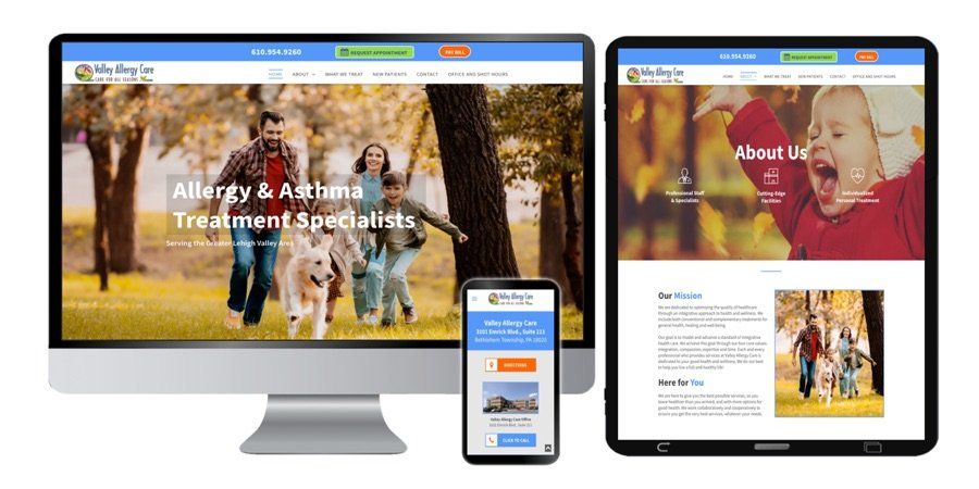
5 - Mobile Responsive (To the Max!)
If you’ve heard it once, you’ve heard it a million times. Your website needs to look good great and be functional on multiple devices – tablets, cell phones, and desktop – so you need to consider the text size, image resizing, layout of your menu, etc. Your website needs to be user-friendly regardless of which devise the user is using. Sophisticated web designers will use advanced technologies that allow them to alter the spacing and font sizes for mobile vs. desktop vs. tablet devices so that your responsive design website is not a compromise favoring one device type over others.
If you still aren’t convinced of the importance of your website being mobile responsive, consider these statistics:
- As of August 2017, there were over 3.5 billion
unique mobile internet users. Source: Statista
- Mobile devices will drive 80% of global internet
usage. Source: Zenith
- Users spend about 69% of their media time on
smartphones. Source: comScore
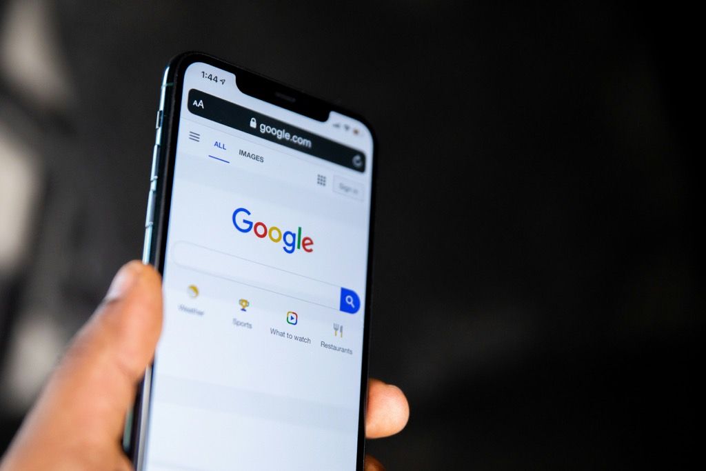
- In March of 2018 Google implemented mobile-first
indexing, which means that the mobile version of your website is the one
that is indexed for search results
Is Your Website Driving Business Your Way? Contact PMI to Get in the Game!
If your website isn’t bringing in new leads and customers, or if it’s not providing the best user experience across all types of devices, then give Power Marketing International a call today at (484) 297-6395 or contact us online for a free web design consultation .

Adapted from “ What Business Owners Need to Know About Web Design.”


